Page Block Reference
Automation
The automation page block allows you to show automation with manual triggers.
The automation page block allows you to use both automation scripts and workflows.
-
there were no compilation errors,
-
you refreshed your page after you’ve added the scripts,
-
the trigger defined a
.uiProp('app', 'compose')constraint.
-
there are no errors in the workflow,
-
the workflow has an
onManualtrigger, -
the workflow is enabled.
Calendar
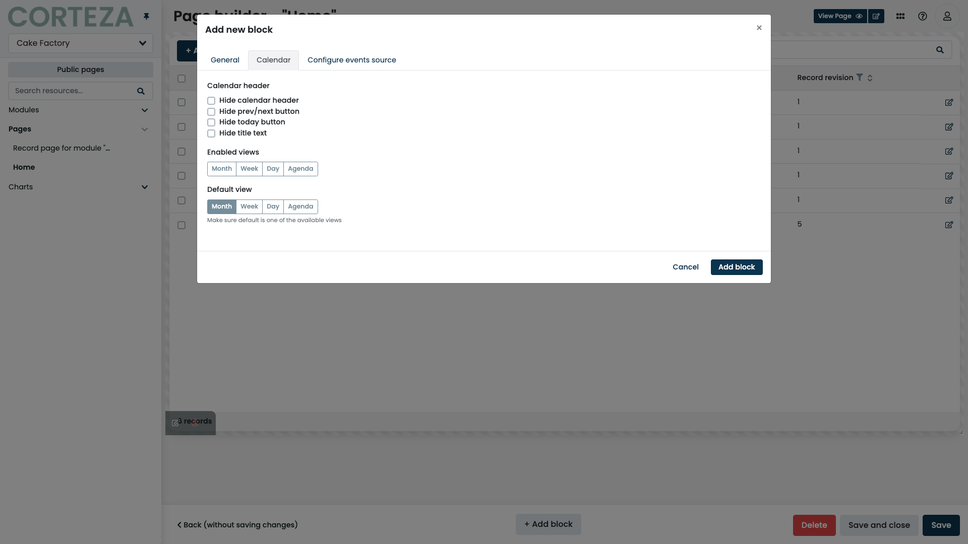
A calendar page block allows you to show events from different event sources in a calendar.
-
month view
-
week view
-
day view
-
agenda view
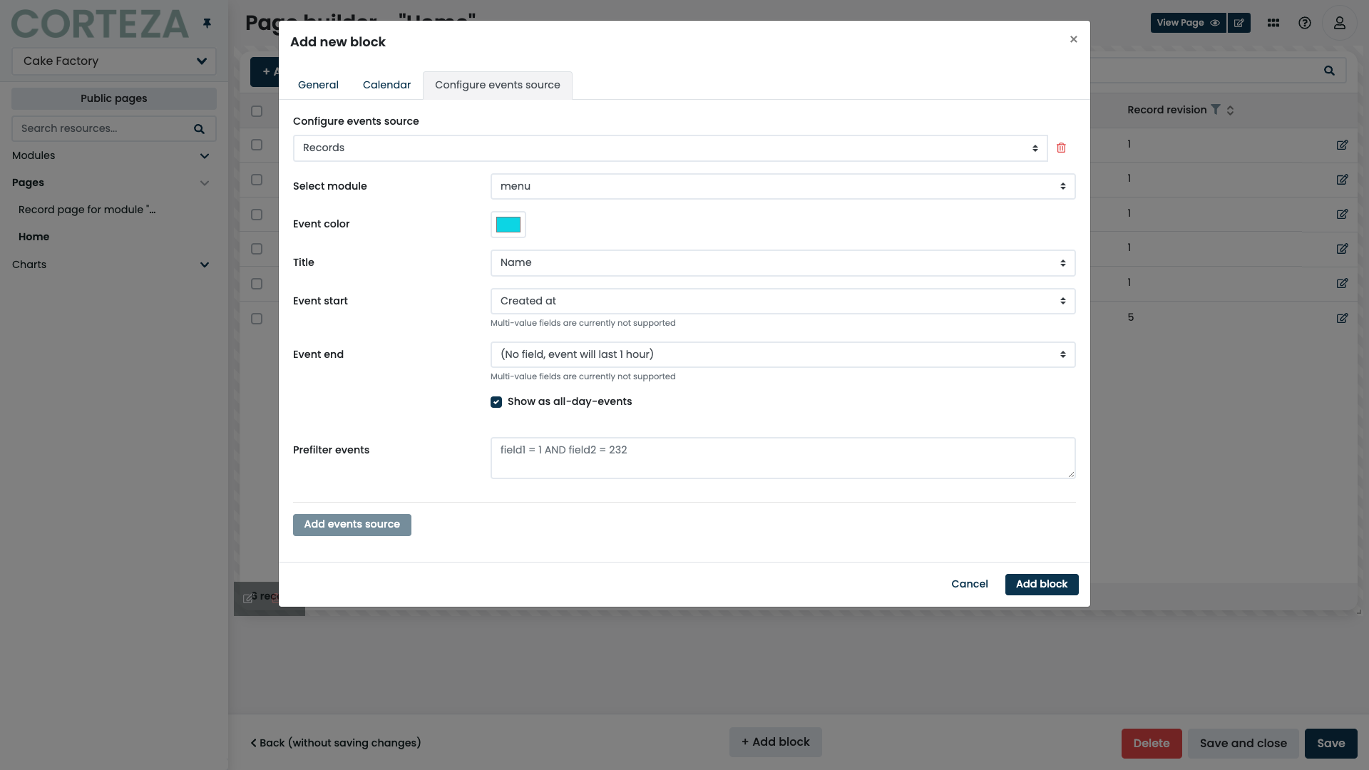
Calendar page blocks support two event sources; reminders and records.
The reminders event source allows you to show your reminders as a calendar event.
The records event source allows you to show a record as a calendar event. This allows you to have a module for storing tasks which you can then show on the calendar.
|
When using records, you can define a pre-filter, which allows you to show only specific records. Refer to the QL reference for details. |
|
The calendar page block pre-filter supports value interpolation. |
Chart
The chart page block allows you to display a pre-configured chart on your page. Refer to Low Code configuration for more details.
Content
The content page block allows you to show static content on the page. This can be an important announcement, a how-to guide, or any other piece of information.
File
The file page block allows you to upload static files such as a TOS, a work schedule, or a brochure to the page.
The attachment is static and does not change based on the current context.
Defines how the files are presented when they are being viewed.
|
IFrame
The iframe page block allows you to embed an external website into your application.
|
Make sure to keep any iframe embedding limitation in mind. |
Metric
The metric page block allows you to display a calculated numerical value based on the data in your namespace. This is usually an indicator important to your process. It may be information such as the total finances in your sales pipeline or the current number of open accounts.
Defines what the metric shows. The label doesn’t define any value restrictions, nor is it required. |
|||
Defines what records will be used when computing the metric. |
|||
Defines how to filter the records when computing the metric. Refer to the QL reference for details.
|
|||
Defines what numerical field is to be used when computing the metric.
Each module has a system-defined |
|||
Specifies how the values are aggregated when the metric is computed.
You can pick one of the |
|||
Allows you to define how the result of the metric is transformed before shown in the page block. Value transformation expressions are written as simple JavaScript expressions that return a single number based on the two variables.
|
|||
Defines the format string that is used when displaying the metric. The field supports all of the numeral.js formatting options. The format is applied before the prefix and suffix. |
|||
Adds the specified prefix to the resulting metric before it is shown in the page block.
For example, the prefix of |
|||
Adds the specified suffix to the resulting metric before it is shown in the page block.
For example, the suffix of |
|||
Allows you to define the visual aspects of how the metrics are shown. |
Record list
The record list page blocks allow you to display records in a table. Record lists also provide the features for adding, importing, and exporting records.
|
When using the search box on the record list, the system only includes the selected fields. |
|
You can trigger explicit automation scripts within the record list’s header. Click the "Automation" tab to select the automation scripts. |
Defines the module that the record list is set to use when interacting with records. |
|||
Allows you to define the fields and their order when displaying the table. |
|||
Allows you to create, edit, and delete records directly from the record list when the containing record page is in edit mode.
|
|||
Hides the + Add record button, which prevents you from adding new records from the user interface.
|
|||
Defines the pre-filter that is used when searching and displaying records on the record list. Refer to the QL reference for details. |
|||
Hides the search input box, which prevents you from applying additional filters to the record list.
|
|||
Defines the initial sorting that is applied when displaying the record list. Refer to the QL reference for details.
|
|||
Hides the sort controls from the record list preventing you from modifying the initial sort.
|
|||
Defines the maximum number of records that can be shown on a page. |
|||
Hides the paging controls from the record list, which prevents you from navigating between different pages. |
|||
Modifies the previous/next page controls to include a list of available pages, which allows easier navigation between pages.
|
|||
Shows the total number of records that conform to the defined filters.
|
|||
Enables the record export option and defines the Export button in the header of the record list. |
|||
Adds a series of checkboxes on the record list, which allows you to perform operations over a selection of records. |
|||
Hides the create reminder button preventing you from making record-based reminders directly from the record list. When the feature is enabled, a reminder can be created by clicking on the reminder button next to the record. |
|||
Hides the clone record button, which prevents you from cloning records directly from the record list. When the feature is enabled, a record can be cloned by clicking on the clone button next to the record. |
|||
Hides the edit record button, which prevents you from opening the record editor directly from the record list. When the feature is enabled, the record editor can be opened by clicking on the edit icon next to the record. |
|||
Hides the view record button, which prevents you from opening the record viewer directly from the record list. When the feature is enabled, the record viewer can be opened by clicking on the view icon next to the record. |
Record organizer
The record organizer page blocks allow you to define a series of columns (stages) that the record of a given module may reside in. The records are moved around using the drag-and-drop interface.
A single record organizer page block defines one column. Add additional record organizer page blocks to define additional columns.
Defines the module that the record list is to use when interacting with records. |
|
Defines the pre-filter that is used when searching and displaying records in the organizer. Refer to the QL reference for details. |
|
Defines what field is used when displaying the record in the record organizer. |
|
Defines additional text that is used when displaying the record in the record organizer. |
|
Defines what field is used to define the order of the records. When a record is repositioned, all of the related records change the value of the fields to represent the new order. |
|
Defines what field is used to define what column the record is in. When a record is repositioned, the value of the given field changes to represent the new state. |
|
Defines what value the key field must have to be shown in a given column. |
Record revisions
The record revisions page blocks allow you to display the revision history tracked for a particular module. The revision history is listed in ascending order, with the latest change at the bottom.
Defines if the record revisions page block should display the revision history unconditionally or if the page block should load the revision history on demand (when unchecked). Keeping the option disabled may help with performance regarding more extensive revision histories, but you can generally enable it. If the revisions are loaded on demand, the page block displays a show record revisions button that allows the user to load the revision history. |
|
Defines if the revision history page block should show all changed values or just a subset. If the checkbox is unchecked, the table underneath lets you pick what fields the page block should show. |
Record
The record page block allows you to display the contents of the records on the record page. When creating or editing the record, record page blocks provide a way of input or manipulation of the values.
|
Record page blocks are available only on record pages. |
|
You can define multiple record page blocks for the same record page, which allows you to group corresponding things together. |
Social media feed
The social media feed page block allows you to embed a specified feed directly into your application.
|
Currently, only Twitter feeds are supported. |
When added on a list page, the specified feed is provided as a fixed URL address.
When added on a record page, the specified feed is provided either as a fixed URL address or as a URL field. Using a module field instead of a fixed value allows a social media feed to change depending on the context.
Comment
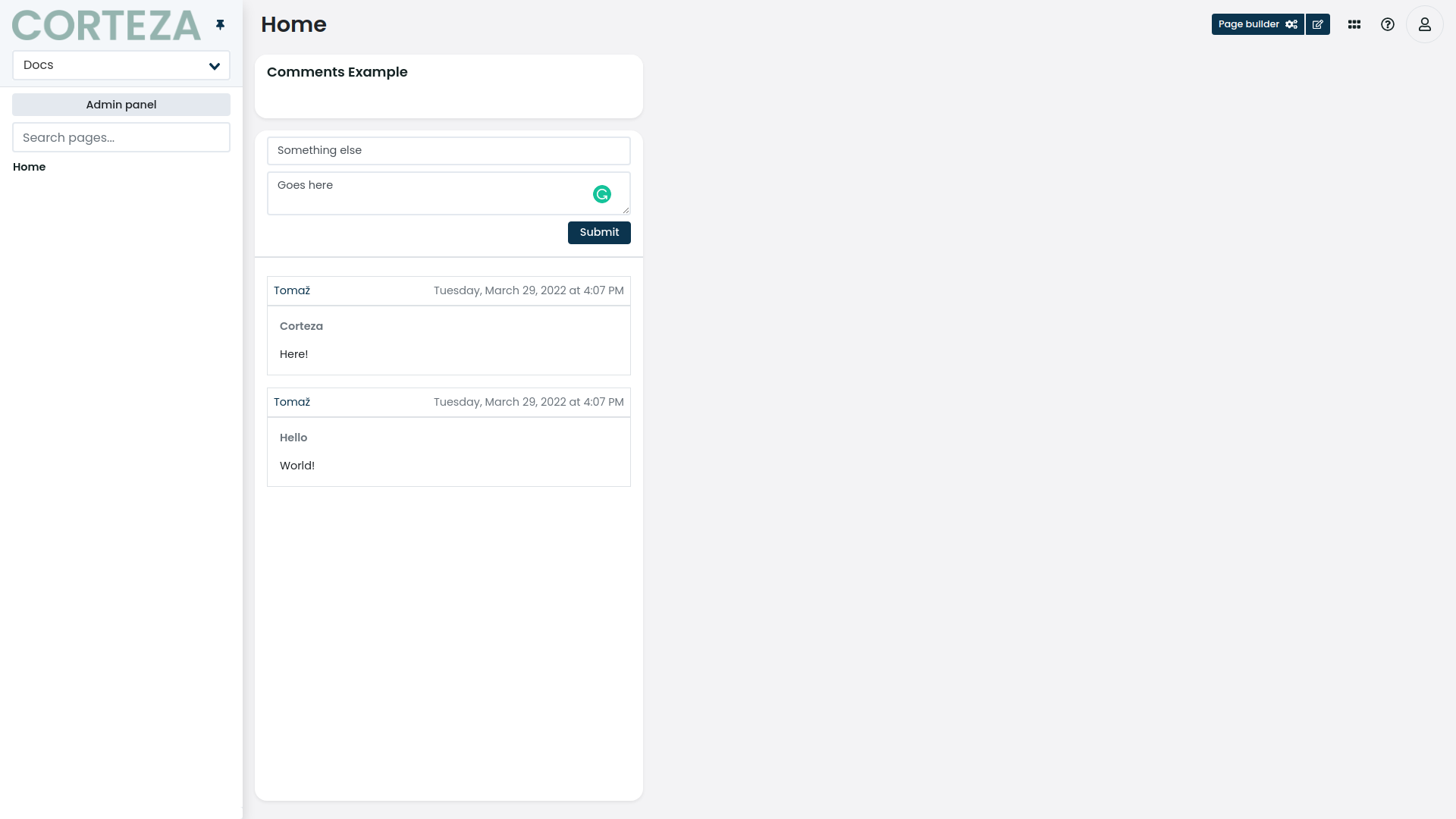
The comment page block allows you to show the records in a comment-like formatting.
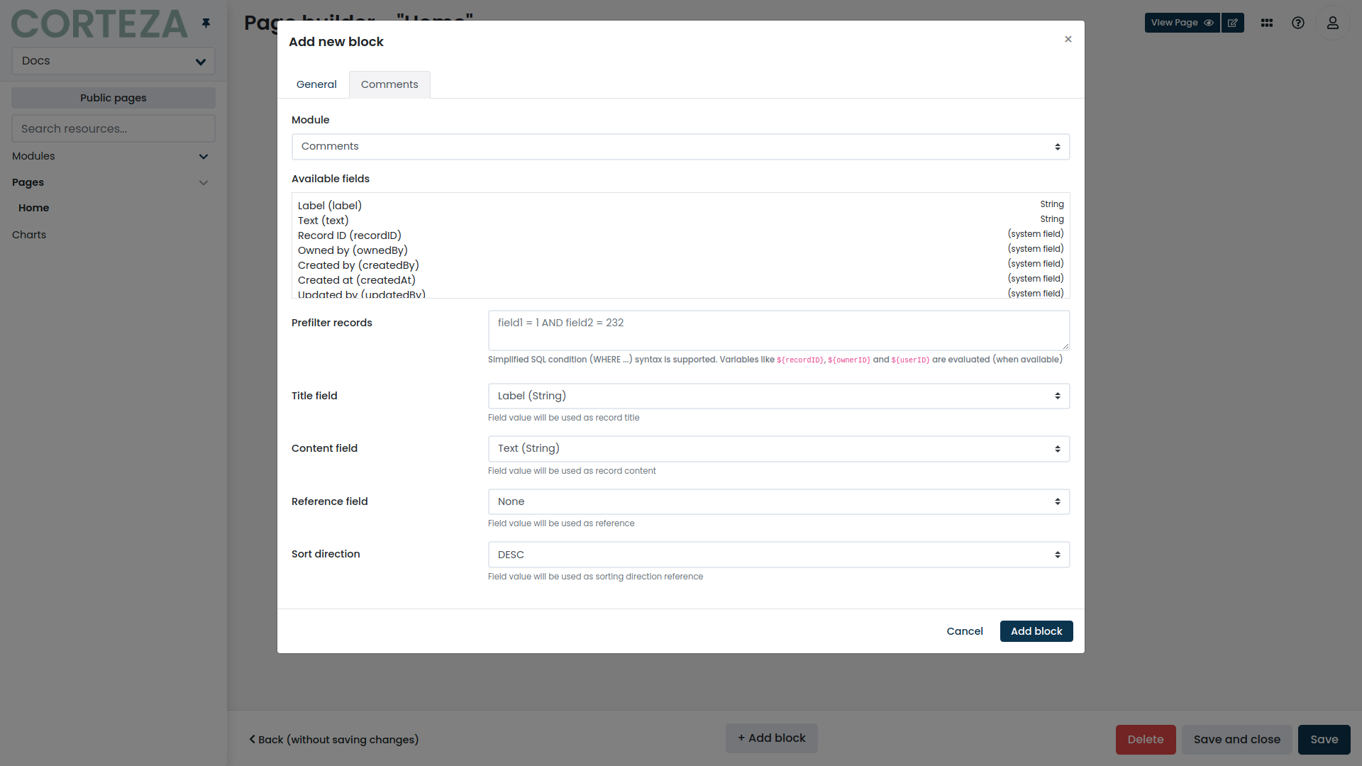
Defines the module that the page block will use when showing the comment list. |
|
Defines the pre-filter that is applied to the records when showing the comment list. Refer to the QL reference for details. |
|
Defines what module field should be used when displaying the comment’s title. |
|
Defines what module field should be used when displaying the comment’s content. |
|
Defines what module field will be used to store the reference to a specific record the comment is for. This allows you to show specific comments for specific records. |
|
Defines the direction in which the comments will be sorted. The sorting is done based on when the comment was created at. |
Report
The report page block allows you to show particular reporter components inside your Corteza Low Code app.
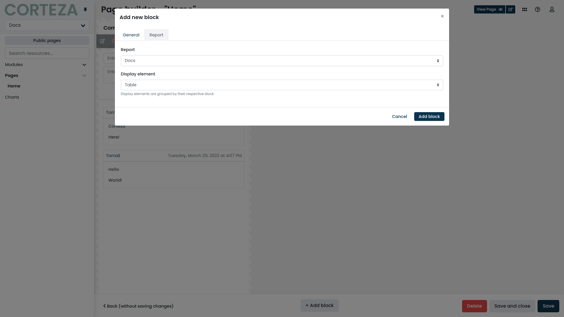
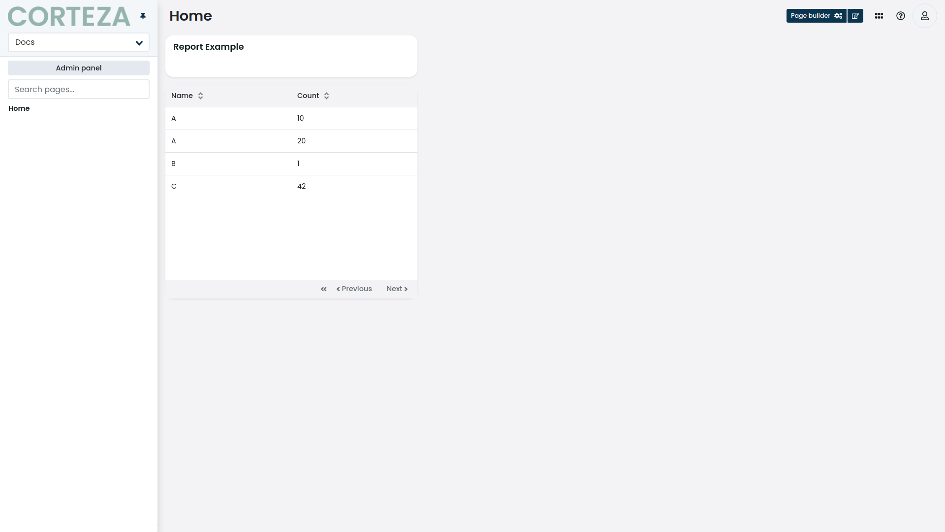
Defines the report the page bock will use when showing data. |
|
Defines the display element from the selected report the page block will use when showing data. |
Map
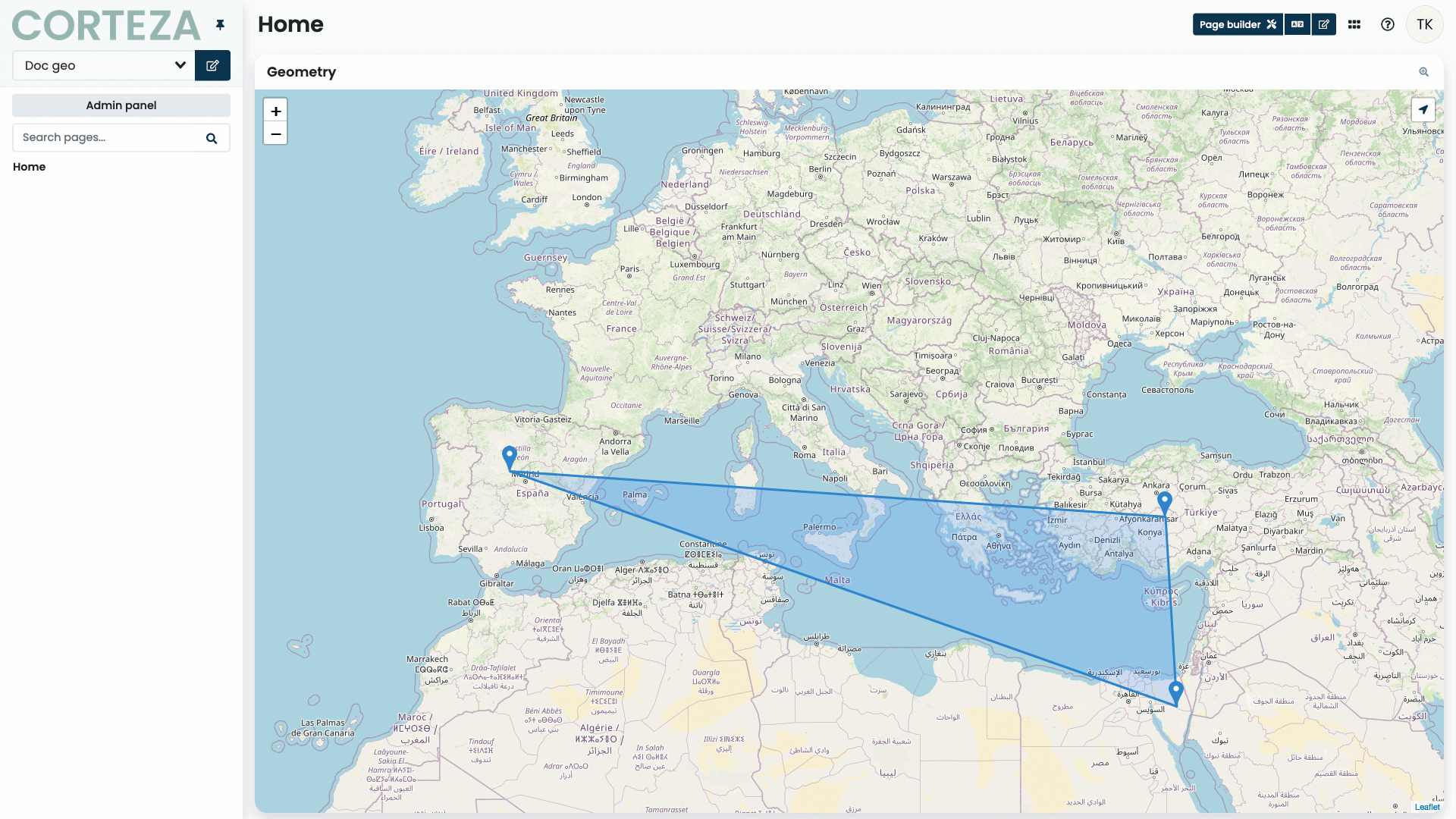
The map page block allows you to show a map with markers, lines and polygons from different Location field values of different record sources.
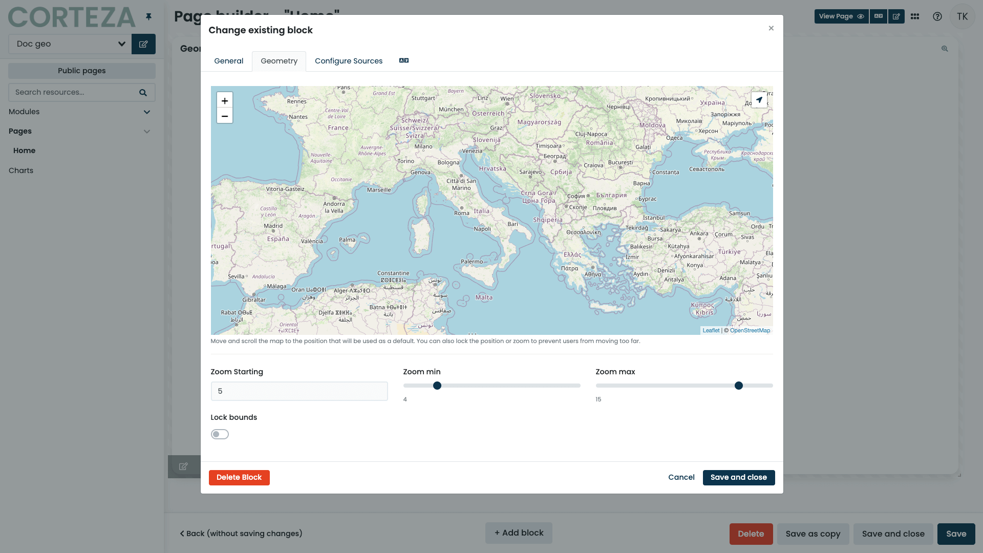
Defines the minimum zoom level of the map. |
|
Defines the maximum zoom level of the map. |
|
Defines if the map should be prevented from being panned out or zoomed out of the current rectangular area of the map, specified by its longitude and latitude coordinates. This means that the map will only display the area within the bounds of the specified coordinates and prevent the user from panning or zooming out beyond those bounds. |
Navigation
The navigation page block allows you to define custom navigation inside your Corteza Low Code applications applications. The navigation can be an addition to the pre-defined one or a complete replacement.
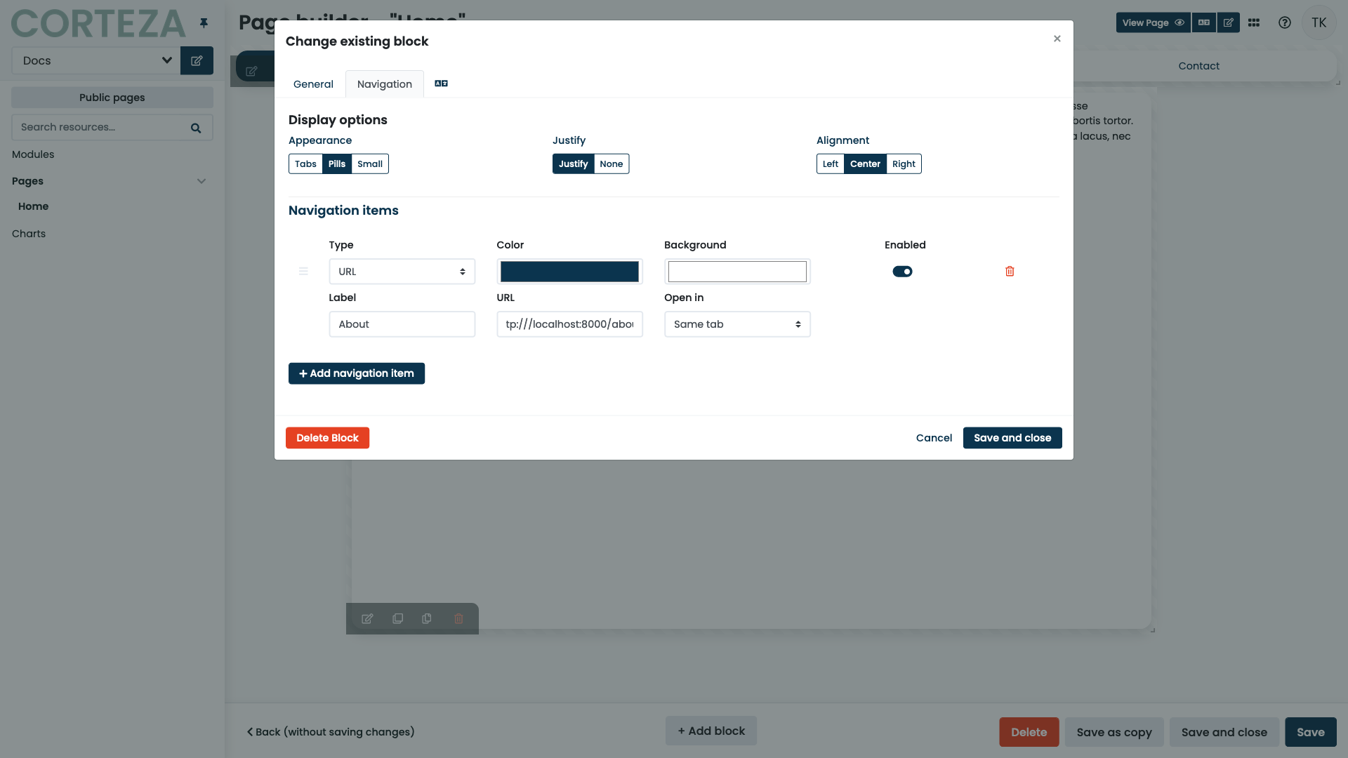
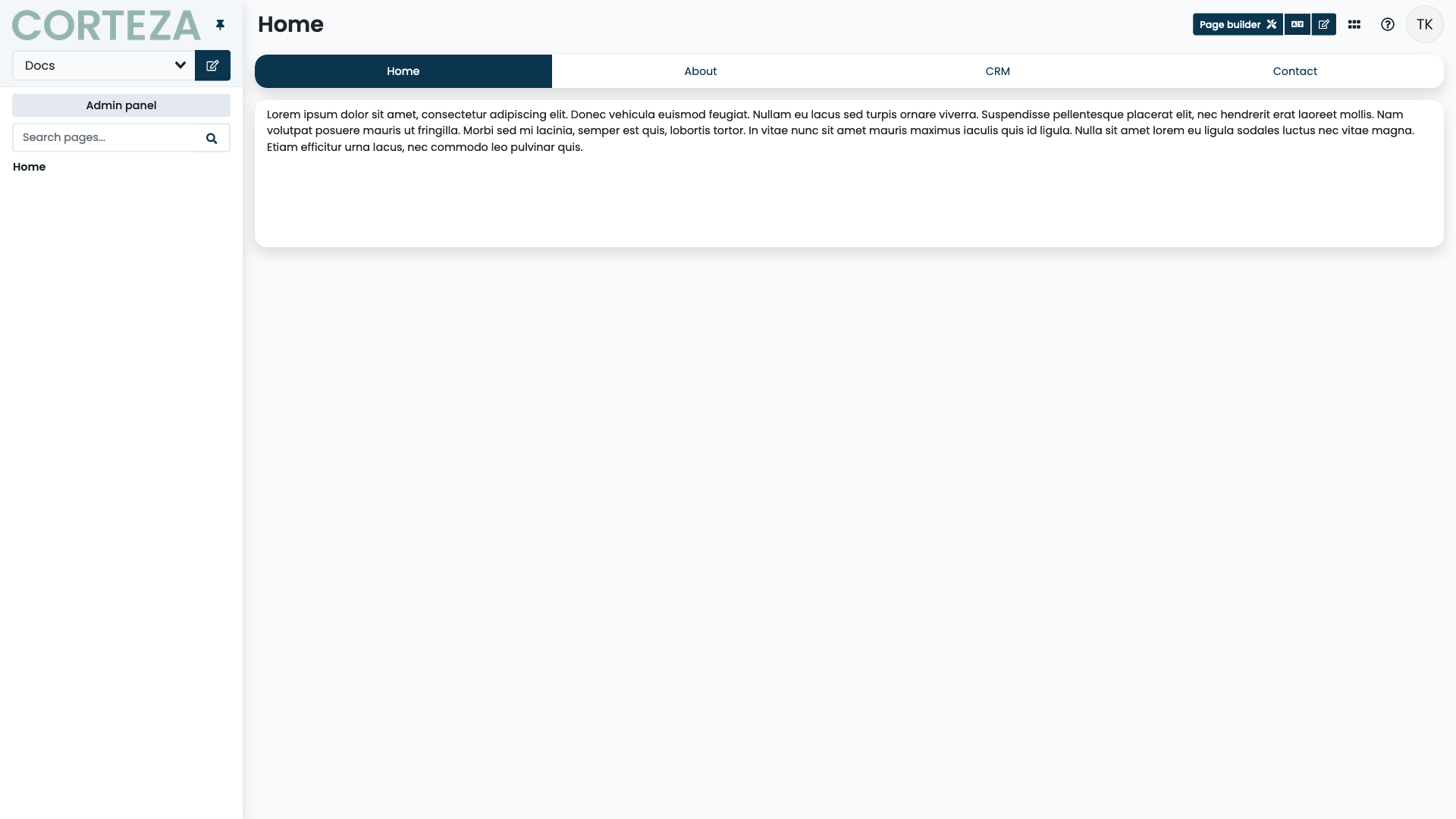
Defines the style of the navigation Supported appearances:
|
|
Sets equal width for all elements on the navigation Options:
|
|
Defines the text alignment of each navigation item Supported alignments:
|
|
Defines the functionality of a navigation item Supported navigation item types:
|