Image annotations
Whenever possible, image annotations should be done programmatically to reduce the amount of effort needed to make images look consistent and conform to our brand guidelines.
|
These instructions should be used whenever possible, but exceptions may apply. For cases where this is not feasible, you may use external programs as long as you follow the style guide and brand guidelines. |
|
DevNote add style guide and brand guideline references. |
Taking screenshots
Screenshots may be taken in any browser you prefer. We suggest you either use Firefox or a Chromium-based browser.
Setting up
Define a new device for taking screenshots. We can define the device with a specific screen parameters so that we can make our screenshots look as consistent as possible.
-
click on the toggle device toolbar button,
-
click on the dropdown containing the list of devices,
-
click on the edit option, add custom device.
Name |
The name does not matter; I (the writer) use "Corteza screenshots". |
Width |
The width must be |
Height |
The width must be |
Device pixel ratio |
The device pixel ratio must be set to |
User agent type |
The user agent type must be set do desktop. Firefox users may use the following value. |
Add a ruler extension to simplify the process of figuring out the pixel position of specific elements on the page. I (the writer) use Smart Page Ruler as I’ve found it to be the best and simplest to use from the offerings at the time of writing.
If you do not wish or can not find an appropriate extension for your browser, you may determine positions manually as long as you follow the brand guidelines and you are consistent.
Screenshots
-
Prepare the page state to contain all of the information you wish to capture (for example, open modals and populate inputs).
-
Open the developer tools and click on the toggle device toolbar button.
-
Click on the dropdown containing the list of devices and select the device you’ve prepared in the setup section.


Annotate
[annotation,role="data-zoomable"]
----
{
  "image": {
    "rel": "workflow/accessing-workflows-1.png",
    "w": 1920,
    "h": 1080
  },
  "view": {
    "x": 0,
    "y": 0,
    "w": 1920,
    "h": 1080
  },
  "annotations": [{
    "kind": "box",
    "x": 818,
    "y": 516,
    "w": 288,
    "h": 250
  }]
}
----
The image parameter describes the base image you would like to annotate.
The image must define the size of the source image (might be improved later).
The rel parameter follows the same rules as the regular image path.
|
If you are planning on using the same image multiple times with different annotations, make sure that you define an To examplify:
|
The view parameter defines what portion of the source image should actually be shown.
This allows you to offset the view and crop the image.
The annotations parameter allows you to define an array of predefined annotation objects.
Box annotations
|
DevNote will be added as requirements change and brand guidelines establish. |
|

|
|
|

|
|
|

|
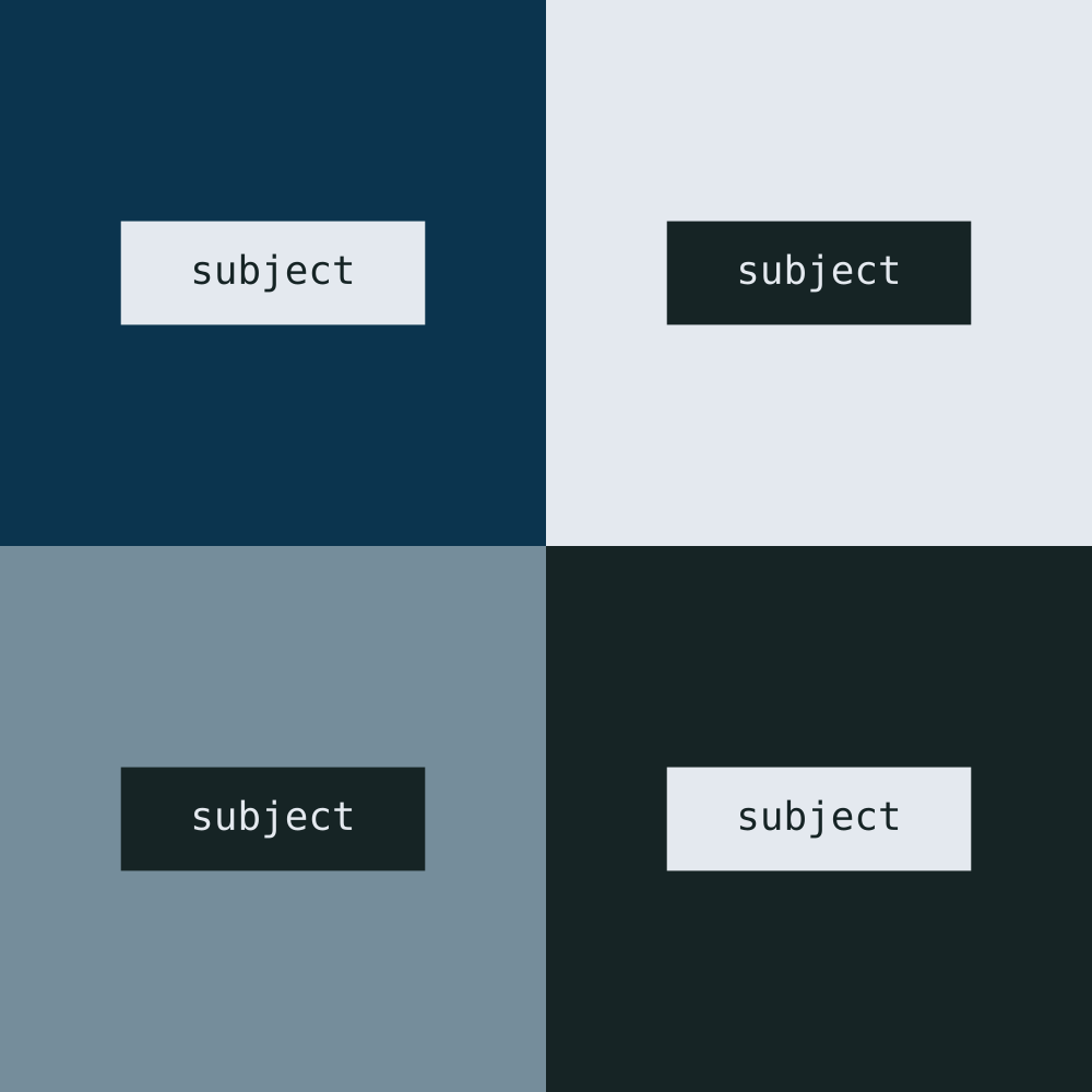
Changing annotation padding
Use the padding property to change the padding of your annotation.
The available options are: xs, sm, md, and lg; where the md option is used by default.
[annotation,role="data-zoomable"]
----
{
  "image": {
    "rel": "documentation/annotation-canvas.png",
    "alias": "annotation-canvas_padding",
    "w": 1000,
    "h": 1000
  },
  "view": {},
  "annotations": [{
    "kind": "box-note",
    "padding": "xs",
    "x": 111,
    "y": 203,
    "w": 279,
    "h": 95
  }, {
    "kind": "box-note",
    "padding": "sm",
    "x": 611,
    "y": 203,
    "w": 279,
    "h": 95
  }, {
    "kind": "box-note",
    "padding": "md",
    "x": 111,
    "y": 703,
    "w": 279,
    "h": 95
  }, {
    "kind": "box-note",
    "padding": "lg",
    "x": 611,
    "y": 703,
    "w": 279,
    "h": 95
  }]
}
----
|

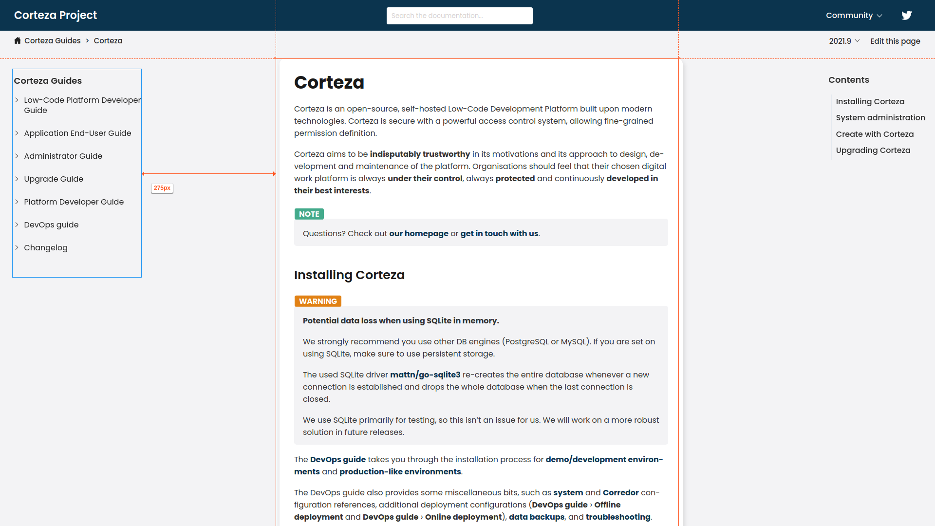
Cropping images
To crop an image adjust the the view property.
x |
The horizontal offset from the top-left corner of the original image. |
y |
The vertical offset from the top-left corner of the original image. |
w |
The width of the resulting image (the area you wish to show). |
h |
The height of the resulting image (the area you wish to show). |
To examplify, lets remove the header and navigation from the following image.
[annotation,role="data-zoomable"]
----
{
  "image": {
    "rel": "documentation/example-crop-base.png",
    "w": 1920,
    "h": 1080
  },
  "view": {
    "x": 545,
    "y": 100,
    "w": 900,
    "h": 970
  },
  "annotations": []
}
----
Cropping and annotating images
To examplify, lets only include the second subject of the following image (the top-right square).
[annotation,role="data-zoomable"]
----
{
  "image": {
    "rel": "documentation/annotation-canvas.png",
    "alias": "annotation-canvas_cropped-note",
    "w": 1000,
    "h": 1000
  },
  "view": {
    "x": 500,
    "y": 0,
    "w": 500,
    "h": 500
  },
  "annotations": [{
    "kind": "box-note",
    "x": 611,
    "y": 203,
    "w": 279,
    "h": 95
  }]
}
----
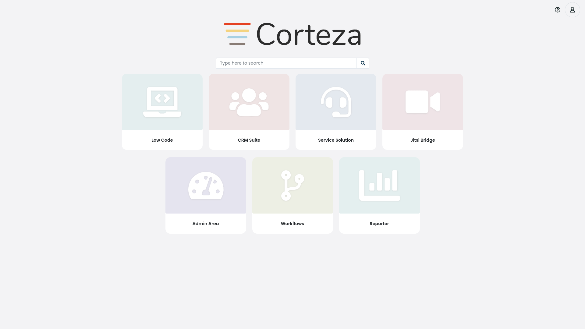
Focusing images
To define the focus on the image, adjust the focus property.
x |
The horizontal offset from the top-left corner of the original image. |
y |
The vertical offset from the top-left corner of the original image. |
w |
The width of the focused area (the un blurred area). |
h |
The width of the focused area (the un blurred area). |
padding |
The un blurred buffer around the focused area. |
To examplify, lets focus on the Admin Area application on the app selector.
[annotation,role="data-zoomable"]
----
{
  "image": {
    "rel": "documentation/example-focus.png",
    "alias": "focus-base",
    "w": 1920,
    "h": 1080
  },
  "view": {},
  "focus": {
    "w": 267,
    "h": 253,
    "x": 542,
    "y": 515,
    "padding": 10
  },
  "annotations": []
}
----
Focusing and annotating images
To examplify, lets focus on the Admin Area application on the app selector with an annotation.
[annotation,role="data-zoomable"]
----
{
  "image": {
    "rel": "documentation/example-focus.png",
    "alias": "focus-annotated",
    "w": 1920,
    "h": 1080
  },
  "view": {},
  "focus": {
    "w": 267,
    "h": 253,
    "x": 542,
    "y": 515,
    "padding": 10
  },
  "annotations": [{
    "kind": "box-note",
    "x": 542,
    "y": 515,
    "w": 267,
    "h": 253
  }]
}
----
Tips and tricks
Determine element positions
You can use a ruler extension setup in the setup section to have an easier time of determining element positions.
Easier annotation placement
Placing annotations may be a tedious process if you need to do some finishing touches such as assuring alignment.
Annotations are rendered as SVG images which allows you to either use dedicated programs like Inkscape or the browser developer console to adjust annotation positioning.
To use the dedicated program simply download the annotated SVG image and open it in the program. You can then adjust the parameters of the annotation configuration based on the adjustments in your SVG editing program.
To use the developer console right-click the annotated image and select the open image in new tab option. Inspect the SVG image and adjust the annotations as you see fit. Use the adjusted parameters to update the annotation configuration.
