C3
Corteza Component Catalogue (C3) is a tool for building UI components in an insulated environment, making it easier to develope independent components.
C3 was inspired by Storybook with the main difference of "hooking into" components instead of defining stories to outline the functionality.
|
DevNot the core logic is in corteza-vue; update those docs as well. |
|
C3 is only used in development mode. In order to use C3, run the following command: |
Structure overview
src/dev-env.js
The src/dev-env.js file defines all of the configuration required by the C3 feature; essentially it defines an insulated Vue application.
Refer to the corteza-webapp-admin; /src/dev-env.js for an example configuration.
components/C3.js
The components/C3.js file is the main registry that defines components usable by the C3 feature.
Refer to the corteza-webapp-admin; /src/components/C3.js for an example configuration
Adding new components
-
define the
.c3.jsconfig file -
define the
.vuecomponent file -
register the component in the C3 registry
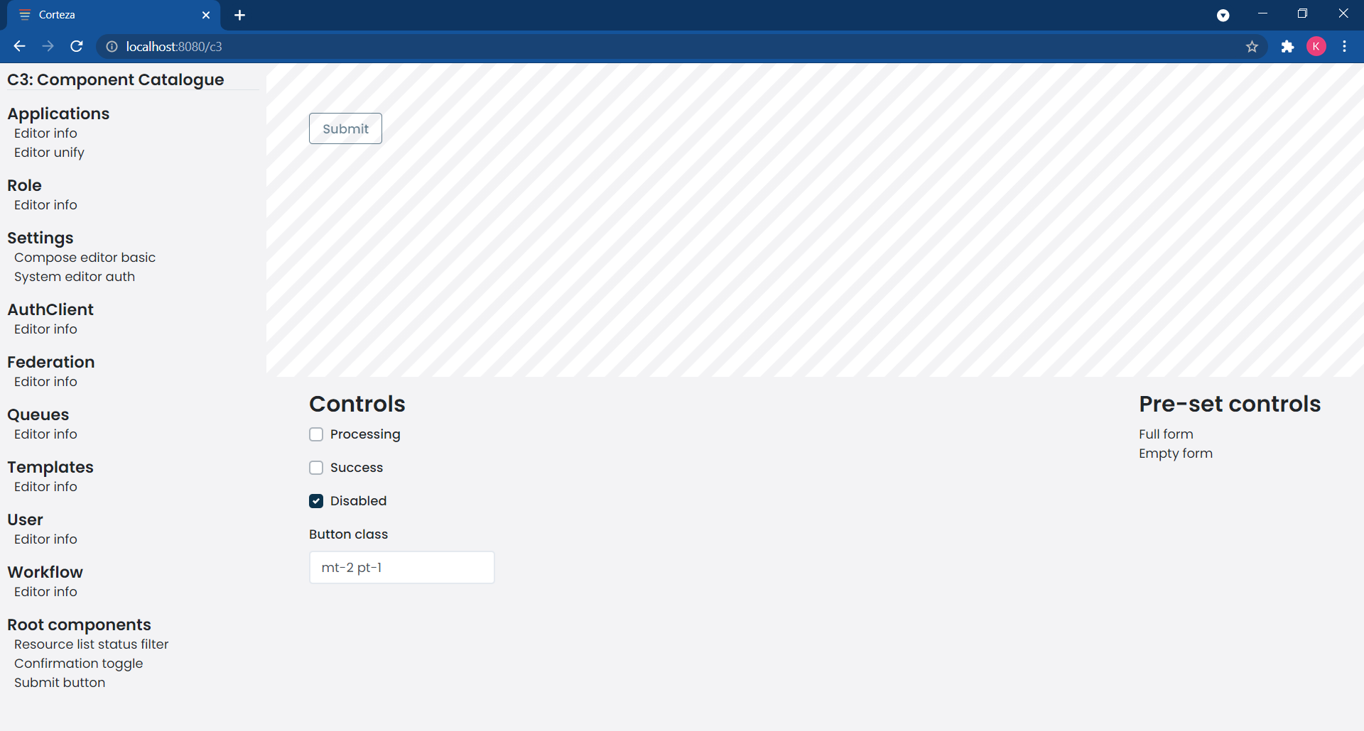
If done correctly, the output should look something like the following screenshot.
Define the config file
The .c3.js config file should be named after the component itself.
To examplify; the Button.vue component should define the Button.c3.js configuration file.
const props = { (1)
  processing: false,
  success: false,
  disabled: true,
  buttonClass: 'mt-2 pt-1',
  variant: 'outline-primary',
  iconVariant: '',
}

export default {
  name : 'Submit button', (2)
  group : ['Root components'], (3)
  component, (4)
  props,

  controls: [ (5)
    checkbox('Processing', 'processing'),
    checkbox('Success', 'success'),
    checkbox('Disabled', 'disabled'),
    input('Button class', 'buttonClass'),
  ],

  scenarios: [ (6)
    { label: 'Full form',
      props,
    },
    { label: 'Empty form',
      props: {
        ...props,
        disabled: false,
        buttonClass: '',
      },
    },
  ],
}| 1 | An object containing all of the properties that should be passed into the component when it is being rendered. Additional properties can be passed through scenarios to modify based on needs. |
| 2 | The name for the component. |
| 3 | The group allows you to group common or related components together. |
| 4 | The component itself. |
| 5 | Defines the set of controls that can be used to interact with the components' properties.
The available controls are: generic, input, textarea, checkbox, and select. |
| 6 | Scenarios define a set of predefined… scenarios to display how the component looks like with different states. |
Add an entry to the C3 registry
To make the component available, you need to register it in the registry.
CSubmitButton component:// ...
// additional component imports
// ...
import { default as CSubmitButton } from './CSubmitButton.c3'
export default {
// ...
// additional components
// ...
CSubmitButton,
}Learning the C3 UI
Registered components are available in the left navigation, nested based on their groups.
When opened, the component and it’s controls are displayed on the right side of the screen.
On the top we have the component.
Bottom-left, we have the controls which allow us to modify the properties of the given scenario
Bottom-right, we have the pre-defined scenarios to outline the more important states the component can be in.